
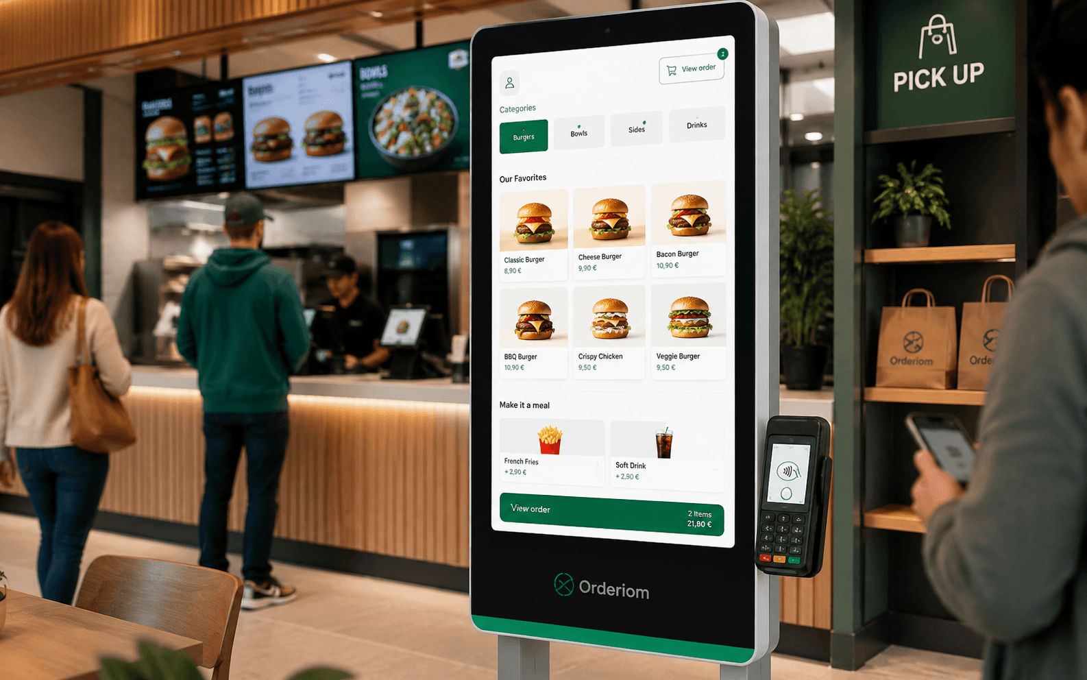
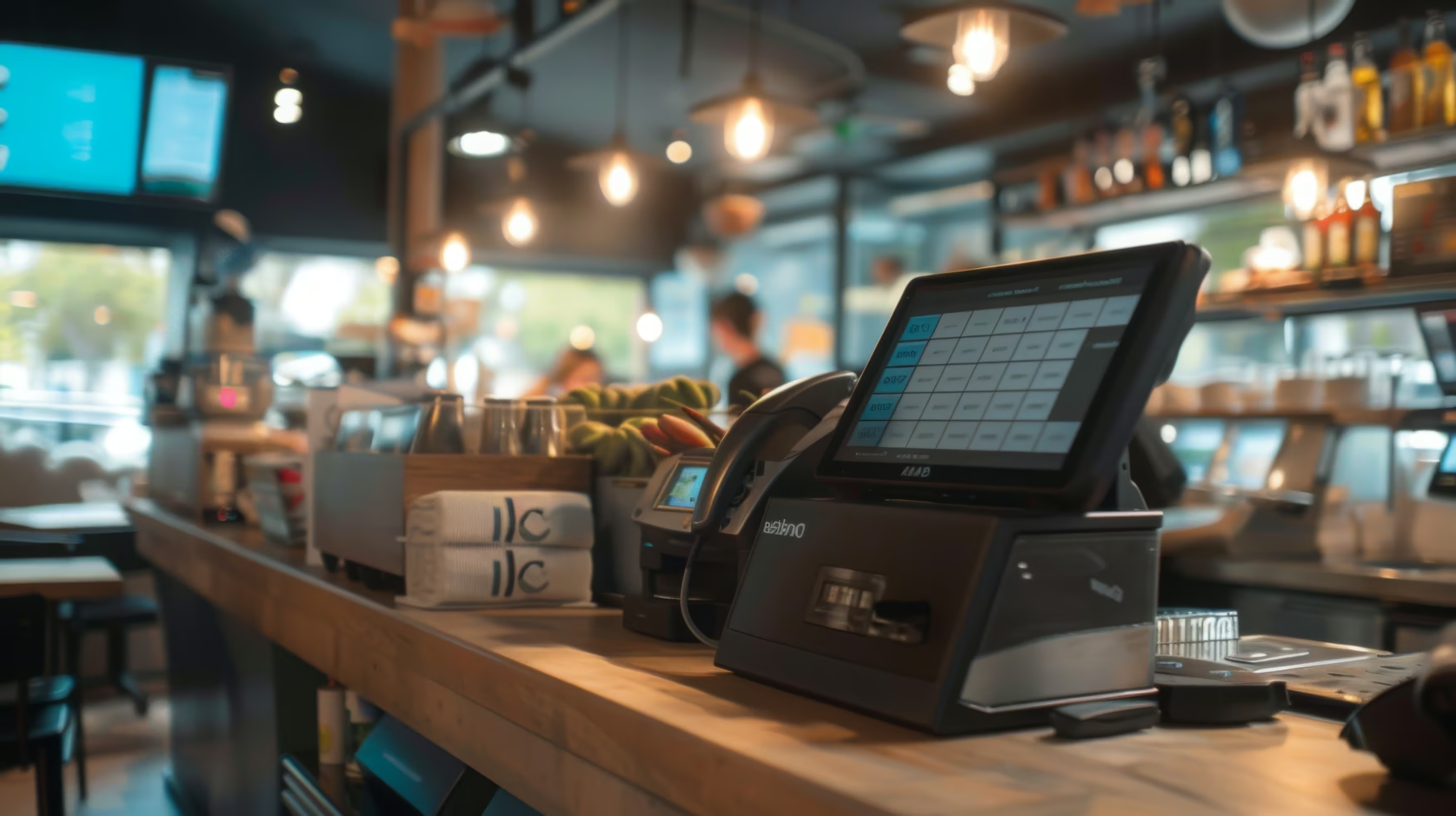
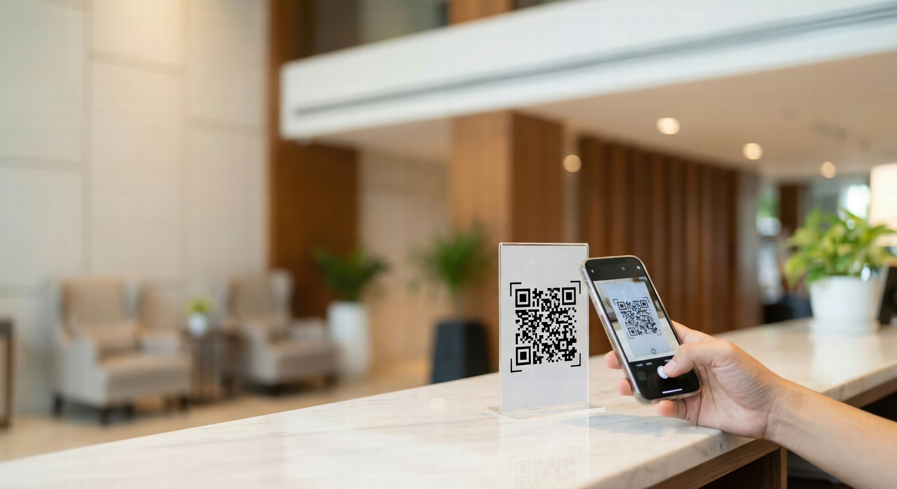
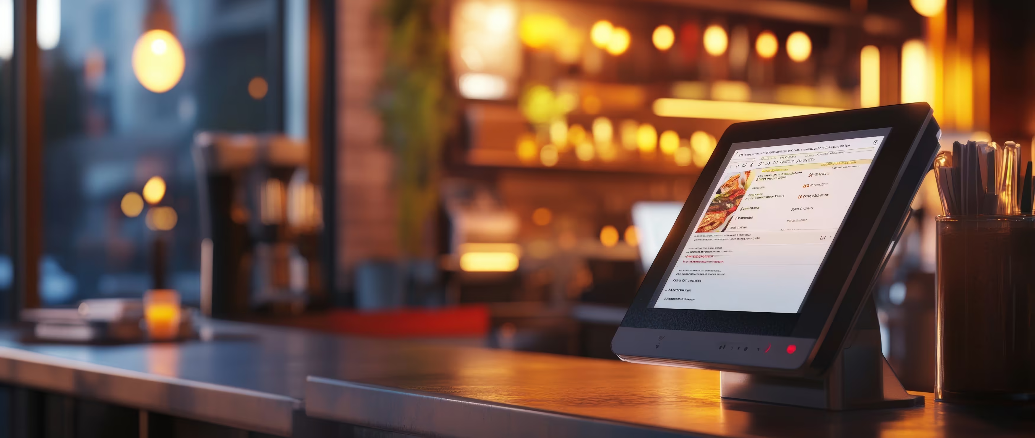



In Germany, the answer is not black or white. According to a representative METRO study, 38% of guests have already used digital menus. Among people under 45, it is 50%. At the same time, 55% prefer cashless payment, and among people under 45 it is even 73%. That sounds like a tailwind for tablets at the table. But reality is more mixed. In another survey in Germany, 43,51% use QR menus when they are available, but only 9,98% rate them very positively, 35,13% still ask for a printed menu and 6,29% leave the restaurant if only a digital menu is offered (METRO study, QR menu survey, May 2024). That is exactly why it pays to take a sober look at hardware, interface, POS system and running digital and paper menus side by side.
Table of contents
- Why tablets at the table are more than a trend
- What really happens at the table
- The real benefit is in operations, not in the effect
- Choosing the right tablet for your business
- Three device classes, three real use cases
- How you should make the decision
- An interface guests understand without explanation
- Readability beats gimmicks
- Navigation must stay flat
- Multiple languages and images only with discipline
- Setting up the POS system connection properly
- What must fit together technically
- These mistakes cost the most in daily work
- Hygiene, maintenance and acceptance in daily work
- Cleaning routine and technical care belong together
- Acceptance means offering both
- Going live in three phases without breaking your service
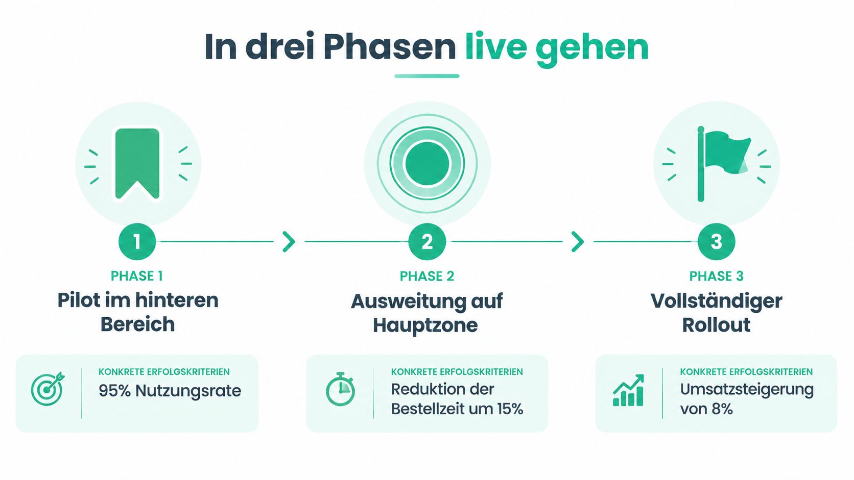
- Phase one: test in the back area
- Phase two: expand only with team discipline
- Phase three: only with a fallback and escalation plan
Why tablets at the table are more than a trend
Many businesses make a simple mistake. They buy a few tablets, upload a PDF and then wonder why service gets slower instead of faster. A tablet at the table is not a screen for the menu. It is a work tool that changes how the restaurant runs – for guests, service and the till at the same time.
What really happens at the table
In practice, the tablet matters not only when the guest orders, but from the moment they first pick it up. The German data shows that there is interest, but no unconditional love for digital tools. 42% want to be able to open a digital menu via QR code in every venue, and 24% even want to order digitally by themselves. At the same time, the printed menu remains a safety net for many people. That is exactly why the hybrid model is the sensible solution in the German market (Bitkom position on the digital menu, Lightspeed survey).
Rule of thumb: If a guest needs three taps to get to the drinks, the interface is too heavy.
So the tablet does not need to feel "digital". It needs to feel natural. It must work like a calm, clear service helper. If a guest first needs someone to explain what to do, the solution at the table has already failed.
The real benefit is in operations, not in the effect
A good digital menu on a tablet helps when prices, daily specials or languages need to change at short notice. In daily work, this is worth more than any design show. Especially in businesses with changing lunch menus, several languages or tight service windows, a well-run tablet saves time. A badly made solution does exactly the opposite.
At business level, the trend is also clear. In Germany, 33% of hospitality businesses currently use a digital menu. According to the digitalisation index, this share is expected to rise to 53% next year (Digitalisierungsindex Gastgewerbe). That is no guarantee of success. It only shows that the market is moving. If you start half-heartedly now, you are building from the wrong end.
Tablets at the table work when they are part of a clean service concept. Without a clear interface, without a fallback and without training, they get in the way. With a clear setup, they are a tool.
Choosing the right tablet for your business
Not every tablet belongs in every restaurant. If you buy only on purchase price, you pay later with breakdowns, display problems or a frustrated team. The right choice depends on how busy your service is, whether you have outdoor seating, how often the device moves between tables and whether guests only look at it or actively use it.
Three device classes, three real use cases
An iPad makes sense if you want a clean user experience, the device is often held in the hand and the environment is controlled. For bistros, modern cafés and design-focused concepts, it is often the most pleasant option, because the display is strong, the controls are familiar and the ecosystem is stable. An Android all-rounder from Samsung or Lenovo is more flexible in budget and device choice. But you need to choose carefully on brightness, housing and charging options.
A POS tablet with a protection rating and hardened glass is the right choice if your business is rougher. This applies to busy venues, terraces, snack bars or concepts where devices get knocked, dropped or wet more often. Here, elegance matters less. What matters is that the device does not look broken after twelve months.
If you put tablets on tables, you must treat them like tools, not like consumer gadgets.
How you should make the decision
If you run a small restaurant with moderate service volume, a solid entry-level tablet with a good holder is often enough. If you run a premium concept, an iPad is often the better fit, because design and feel match well. If your daily work is tough, take a device built for restaurant use. Otherwise you will buy twice.
For the connection to the till, choose a solution that does not just look nice, but fits into how your business runs. Orderiom for POS tablets in restaurants is one example of a platform that connects tablets as an ordering tool with POS systems. But the same rule still applies: the device must fit the business, not the other way round.
An interface guests understand without explanation
The best hardware is useless if the interface is built like a brochure. Guests do not want to learn. They want to find things. A good tablet menu looks as if it has always been there, with clear paths, large elements and few distractions.
Readability beats gimmicks
Text must be large enough to read at normal arm's length. Long descriptions are no proof of quality. They are often a sign of uncertainty. If guests have to decode the ingredients before they order, the interface is too cluttered.
In Germany, readability is not a side issue. In the Telekom survey, 23,55% complain that QR code menus are displayed too small, and 12,18% do not feel confident enough with technology to use them (Digitalisierungsindex Gastgewerbe). In practice, this means strong typography, enough white space and high contrast are not design whims. They are a must.
Navigation must stay flat
The menu structure must not get lost in sub-levels. In most businesses, two levels are fully enough: home screen, category, item. A guest at the table normally needs nothing more. The more taps they need, the more likely they order later or not at all.
The core paths belong on the home screen, such as food, drinks, allergens, language choice and, if available, the payment function. Everything else goes further back. Animations, flying banners and unnecessary transitions look good in a pitch deck. In service, they cost time.
Clear principle: The interface must still feel right when a guest orders with one hand and holds a glass with the other.
Multiple languages and images only with discipline
Multiple languages only work without an app download and without detours. A guest does not want to open an app store first. They want to order right away. Good images help, but only if they are compressed and load fast. Files that are too large turn a calm ordering flow into slow waiting.
If you set up a digital menu properly, check four things before going live. First, are the touch targets large enough? Second, are contrast and text clear even in evening light? Third, does the user need only a few steps to order? Fourth, can staff step in at any time without a big explanation?
A digital menu with ordering is not an end in itself. It is a way of serving guests. If this principle is missing, nice images will not help.
Setting up the POS system connection properly
The biggest weak point with tablets is rarely the tablet itself. It is the integration. If the digital menu and the till work separately, you get double entries, wrong receipts and annoyed staff. Then digitalisation turns into extra admin work.
What must fit together technically
The item structure on the tablet must follow the same logic as in the till. Categories, variants, extras, allergens and tax rates must not be improvised. If the front end is built differently from the receipt, the team loses track, and so does the kitchen.
Many systems today work with REST APIs, others with proprietary interfaces or vendor-specific SDKs. With common POS systems such as Lightspeed, Gastrofix, orderbird or ready2order, the name does not decide. The quality of the connection does. The more open and documented the interface, the lower the integration risk.
These mistakes cost the most in daily work
Missing real-time sync is a classic killer. If a dish is sold out, it must disappear at once. Otherwise the guest orders something the kitchen cannot deliver. Mapping table numbers to order numbers is also critical. A clean receipt without the correct table is worthless when things get busy.
Offline buffering is just as important. Wi-Fi outages happen, and then the system must not stop completely. Responsibilities must be fixed before launch. Otherwise the software partner and the POS vendor push responsibility back and forth while service waits.
Before going live, always check who reacts first in an outage, who corrects receipt errors and who approves the return to normal operation.
Clear contracts are not bureaucracy here. They are risk management. Agree in advance who rolls out updates, who logs errors and who can be reached for integration problems. Test these cases: an item is not sent to the till, a table is created twice, and the connection drops briefly at peak time. If these cases do not work in the test run, they will hit you later during service.
Hygiene, maintenance and acceptance in daily work
A tablet at the table is touched by many hands. Without a clear cleaning and maintenance plan, you save nothing. Instead you risk a poor look, problems in operation and guests who lose trust. Cleanliness is part of product quality.

Cleaning routine and technical care belong together
Daily cleaning needs a fixed rhythm, not a spontaneous solution. Clean tablets with a suitable, mild cleaning product. On anti-glare glass, harsh products are not allowed. The shift plan must clearly say who cleans, who reports visible dirt and who keeps spare devices ready.
Maintenance also means the software must not be left alone. App updates, storage clean-up and battery checks belong in the routine. If a device gets weak, replace it early, not after the first complaint.
Acceptance means offering both
In Germany, a hard full switch is the wrong answer. The Lightspeed survey shows that 35,13% still ask for a printed menu and 6,29% leave the venue if only a digital menu is available. Older regular guests in particular do not want to learn how to get through the menu first.
That is why a hybrid setup with paper and tablet is the right standard in many businesses, not an emergency solution. This is especially true where regular guests, an upscale atmosphere or well-organised processes matter. A paper menu plus a tablet is not a contradiction. It is good service practice.
Clear advice: If you only offer digital, you save in the wrong place and cause unnecessary lost orders.
In daily work, this means the team always knows how to switch to paper right away if a guest asks. Guests should be able to choose, not have to argue. This way the digital menu stays a helpful tool and does not become a test of patience.
Going live in three phases without breaking your service
A big-bang rollout is the fastest way to make a good system look broken. If you put tablets on every table on day one, without a load test, clear responsibilities or a fallback, you risk chaos in service and a frustrated team. The better way is step by step, controlled and with hard criteria.
Phase one: test in the back area
Start with a small zone or a quiet shift. There you quickly see whether guests understand the interface, whether the till keeps up properly and where the team gets stuck. Success here does not mean "it was somehow okay". It means orders go through cleanly, errors are spotted at once and the feedback from service is reliable.
Phase two: expand only with team discipline
Once the pilot works, expand to one more station or one fixed staff member. This phase shows whether the team can handle standard problems, such as empty batteries, wrong table assignment or short Wi-Fi drops. You need short, clear training here, not a PowerPoint show.
Phase three: only with a fallback and escalation plan
The full rollout comes last. By then, the printed menu must stay available as a fallback, the late shift must know the same process as the day shift, and a fixed escalation path for technical problems must be in place. If people are still discussing who calls or who restarts in this phase, it is too early.
The most common mistakes are always the same: no test under load, no clear responsibility between service and tech, removing the paper menu too early, and too little thought for regular guests. If you avoid these mistakes, you do not just use a tablet. You build a reliable way of running your business.
Orderiom connects digital menus, order flow and POS integration in one setup that suits tablet solutions at the table and hybrid workflows. If you want to do more than digitise your menu, and integrate it properly into service and the till, take a look at the options directly at Orderiom.